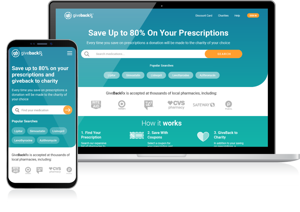
GiveBackRx is a prescription discount card that helps users save money and donates part of the profit to charity. GiveBackRx empowers users to improve their health and give back to the communities and causes closest to their heart.
Many customers do not have insurance, cannot afford their medication, and often overpay at the pharmacy. We designed a solution to make finding the most affordable prescription quickly accessible.
User Experience | Visual Design | Art Direction
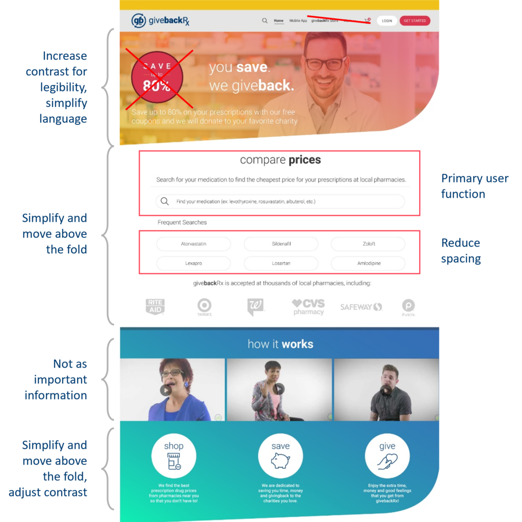
In our commitment to offering the best prices to our users, we embarked on a comprehensive website redesign aimed at prioritizing user needs. Initially, when designing the GiveBackRx website, the approach was to inundate users with numerous features, hoping that some would resonate. However, after thorough competitor and website engagement analysis, it became evident that we needed to streamline the functionality to focus solely on the essential elements: finding discount coupons and supporting charitable causes.
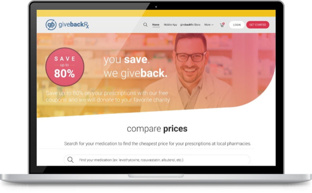
In addition to simplifying the entire user experience, we prioritized a brand refresh to alleviate the visual overstimulation present in the original design. Our aim was to provide users with a simple, calming experience that instills a sense of trust.
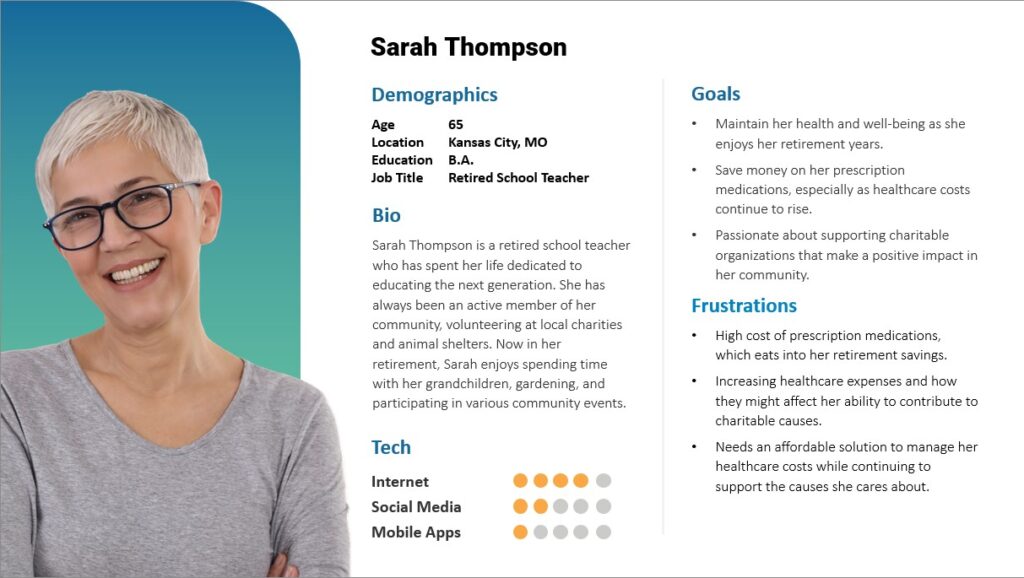
The GiveBackRx website is crafted with users like Sarah Thompson in mind. We focus on creating an intuitive interface to make it easy for older individuals to find and use prescription discounts.
Our design also emphasizes the charitable component, ensuring that users like Sarah can seamlessly connect with causes they support while saving on healthcare expenses.
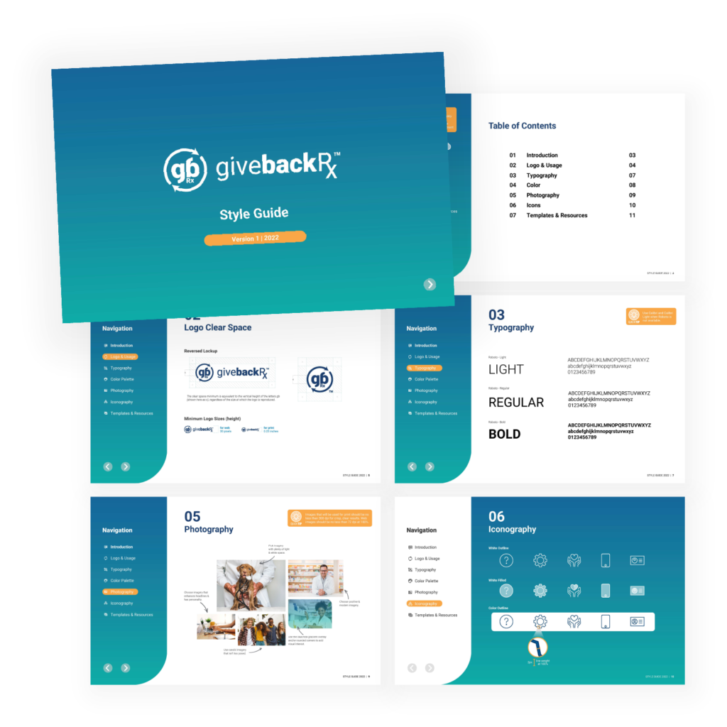
Taking into account the target audience and their needs, we developed a comprehensive UI kit to ensure visual consistency, enhance accessibility, simplify, and establish a cohesive visual language. The UI kit was crafted with color psychology in mind, aiming to foster trust and confidence among our users. The contemporary and refined brand aesthetic offers users a delightful visual journey while navigating the website.
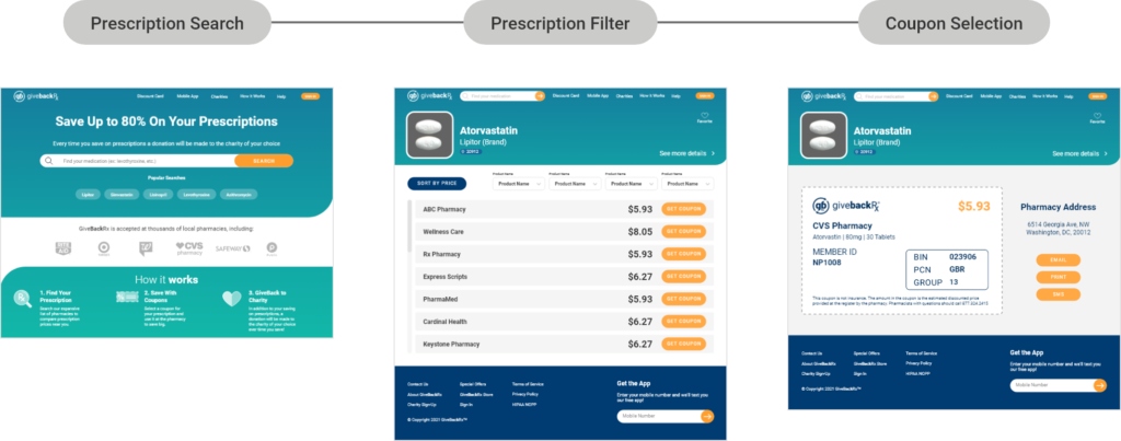
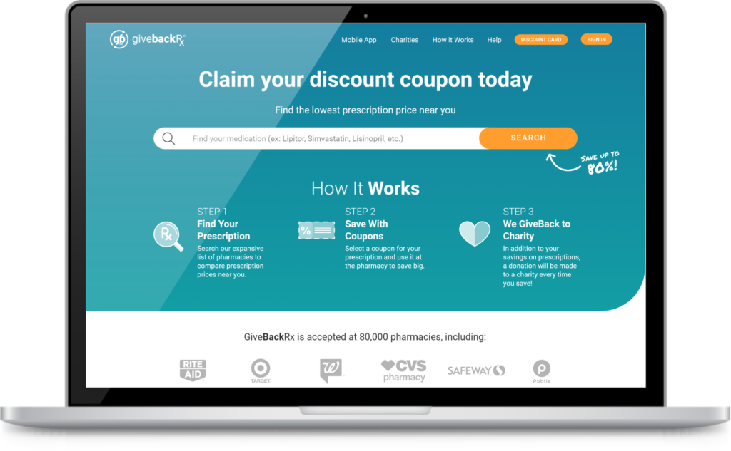
After conducting user research, analyzing competitors, and establishing the brand and UI kits, we proceeded to develop the MVP. To maintain simplicity, the final MVP prototype adheres to a straightforward three-step process that users must follow to access the most cost-effective prescription price.
I crafted the UX to emphasize essential elements for users to effectively locate a coupon, which includes searching for a medication, filtering for their preferred pharmacy and price, and saving their coupon for later use. I then created a robust prototype for testing and iteration on the design before collaborating with the development team to actualize the website.
Due to resource constraints, I wasn’t able to conduct thorough testing of the UX with our target users. However, we internally tested our product with individuals from the team who were not directly involved in the update process.
The journey with GiveBackRx underscores the importance of centering solutions around user needs and embracing the philosophy that less can indeed be more.
Through each iteration, I consistently approached design changes through the lens of the user, ensuring that the end product resonated with their expectations and preferences. This project has taught me the value of integrating design expertise with UX principles to deliver streamlined experiences that effectively communicate and engage users.
